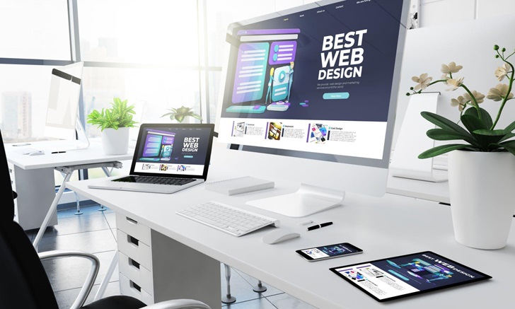
Website designing is a challenge, especially for beginners. The web design process is not impossible with little experience but someone aiming to gain online exposure can do it easily with a little advanced planning.
Laravel web development experts at Steadfast Collective can help you in creating quality and functional digital products.
Elements to consider when you design a website
Who is your target audience?
Understand the demographic, so that you get clarity on how to design. For example, if you are selling clothes to young people then look at pop culture websites to get inspiration.
Is the website large?
It is time to plan a structure or a blueprint. Start with a homepage and from there creates a site map involving other web pages. Each page needs to be linked with the homepage including about us, contact, blogs, etc. Consider website scale and information amount to display.
Content
While designing, content may get ignored but never underestimate it. Users prefer a blend of a well-designed websites with interesting content. Content will keep visitors engaged on the site for a long time. Unclear messages can turn them off, so publish a compelling brand message from an SEO perspective.
Graphics
After creating a content strategy, you need to consider the graphics. Ensure to use a professional photographer for capturing original and innovative images. DIY photography is the cheapest way but there are chances your website will suffer.
For a high-quality brand there is a need to maintain its image professional and for this right image quality is essential. Stock images can be used, but can be generic and unable to powerfully represent your brand. Go professional!

Image Credit: https://www.istockphoto.com/photo/shot-of-two-men-working-on-their-computers-in-a-modern-office-gm1319189303-406114931?phrase=website%20design
Branding
Some brands just exist on the website as a visual representation of a business. A website must have a logo to structure its brand image. Even the fonts used on your website matter!
Currently, Sans Serif is popular because it is easy to read. Consider color theory – for example, eco-friendly products need to use green to represent the brand’s green nature.
Usability
Visual cues speak so is essential for web design success. Consistency is the major consideration for usability. The elements you plan to use like hovering, buttons, and menus need to be differentiated.
For example, place clickable elements like buttons within rounded rectangles never use this visual hint for other elements.
Subtle signs train users to instinctively use your website. Hamburger menus are used on lots of websites, but from a usability point, they are not as intuitive as header navigation. Create a simple journey for a better user experience.
Layout
Organize the webpage to get a good balance of text and images. Give a simple structure for it helps the user digest the information with ease. Hierarchy needs to be distinct for better website navigation.
Keep visual cues minimal to avoid user confusion about the layout. Simple and minimal makes it easy for the user to find the content they came in search of.
Responsive
Internet is consumed by different devices ranging from TVs wide screens to smartphones. Screen sizes differ but the responsive design ensures that the website is suitable for every kind of different device.
Check out amazing website designs online for inspiration!

